Pages

Tuesday, August 23, 2011

Shirley and Andy, Made in Dreams!

My favourite types of Vintage wedding? 
The ones that are authentic. Hands down, my favourite era is the glamorous 20s to 40s. Pre-war decadence and excess as hemlines rose and morals slipped ;) Give me a stunning silk evening gown with embellishment, the full on red-lipped face and perfect pinned waves any day of the week. But the very best ones don’t stop there, with era appropriate blooms, and entertainment that recreates a mood of prohibition recklessness for the perfect party.

Your Kind of Vintage...
Of course, when it comes down to it, what really makes any wedding is you. How you make it vintage is completely personal. Forget the purists or embrace them and craft your wedding by cherry picking the perfect details, fabulous gowns and stylish decor you see on these very pages.


THE COUPLE
Shirley and Andy

The Inspiration
She has a lil vintage in her! She told me exactly what she like for her wedding dress when we first met. A petite dame who has all it takes to be an elegant and classic bride inspires me to design this classic gown for her big day!

The Bride wore
The design is vintage yet chic. With corded lace appliques all around the dress and delicate details like tulle pleats around the neck all the way to the empire cut. The dress is designed in a way to suit her petite figure and yet to enhance the sweet personality in her. One of the dress I LOVE so far!

The Photographer
A big thank you to i-Simplez Photography for allowing me to use their photos for this post. First heard their name through Shirley and their work are just amazing! Love the way they capture the gown! 


xoxo...

Saturday, January 8, 2011

LOVE CHASE: GWEN & BERNARD

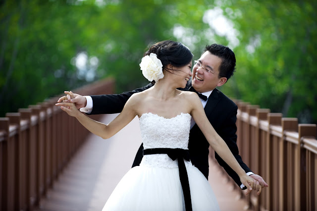
I was so excited to hear from Daren of Daren Chong Photography and see his work, and I’m thrilled to get to share it with you today. He sent over these sweet engagement photos of Gwen and Bernard, and in addition to adoring his photography, you know how much I love breeze! I have never posted these many photos before but all of the photos that Daren gave are just so lovely. I just couldn't resist highlighting here!

I love these photos – they just make me smile! It’s just so obvious from these photos how happy and relax Gwen and Bernard are – and isn’t that exactly what your engagement pics should show?


A charming engagement shoot from the talented Daren Chong...


THE COUPLE
Gwen and Bernard


The Inspiration
Gwen and Bernard have signed up a bridal package in one of the bridal house in early 2010, felt disappointed with the gowns condition and the photography skills offered. But all they want is just a simply easy, relaxing shoot with cool photographer and Gwen's dream wedding dress. Gwen is a sister of a friend of mine in Taylors College, Graece. They decided to have another set of bridal portrait session with Daren not long after the first one with the bridal house.

The Bride wore
Fluff me up! That's the word to describe Gwen's dream dress! She loves the idea of what Kate Hudson wore in Bride Wars. Thin straps and pretty bow at the front side. But I would say it's total different design in the end because it is supposed to be created to suit Gwen and not just any other bride! She chose black for the bow. The front top is a sweetheart strapless embellished with Swarovski crystals and tiny little pearls. The back of the top is layered with a layer of tulle and decorated with lace applique. The skirt is fully fluffed up and pleated with thousands of pleats and layers and layers of tulle to create the translucent effect.

The Groom wore
Bernard wore a black tuxedo for the day, by Bespoke.

The Photographer
I met Daren for the first time in a photographer's gathering in December 2009. And not long after that, Gwen told me that he is engaging Daren for her bridal portrait. The first thing I did was, I quickly googled and found darenchong.com. I viewed most of his posts and fell in love with his work instantly. His work are generally vibrant and if you look at his photos, you can feel that the couples are not faking their smile of their pose. The happiness is just "In Your Face"!

Thanks so much to A Bryan Photo for sharing Gwen and Bernard’s love shoot and with us! 

Happy Saturday!
xoxo

Wednesday, January 5, 2011

I ♥ Green, 2011...


Here we are, the first Wednesday of 2011.. Something strikes me today. It's the green color. I have been always wanted to convince my bride to consider green as they look pretty cool and glamorous, depending on which green you choose. So I decided to have this crazy idea of giving a flat rate for my bride who is going to try on the Greens this year!

The Pantone Fashion Color Report for Spring 2011 features commentary from fashion insiders and leading retailers discussing the geographic locations currently influencing fashion and design. Industry gurus highlighted in the report include: Cate Adair, costume designer for "Desperate Housewives"; India Hicks, creative partner at Crabtree & Evelyn; Simone Legno, chief creative officer at Tokidoki; Lanie List, chief merchandising officer at Iconix Brand Group, Inc.; Collier Strong, celebrity make-up artist; and Essie Weingarten, founder of Essie Cosmetics, Ltd. Contributors from Saks Fifth Avenue, Neiman Marcus and Macy's also weigh in.

Citing exotic destinations like Africa, India, Peru and Turkey as inspiration for spring 2011, designers continue to satisfy consumers' need to escape everyday challenges with intriguing color combinations that transport them to foreign lands.

Spicy, gregarious and persuasive describe Coral Rose, a sophisticated orange that, much like Beeswax, a warm, honeyed yellow, conjures up feelings of faraway lands and locales. Pair either of these piquant hues with a cool, refreshing color-wheel opposite like Regatta for a vibrant color combination that will add zest to any wardrobe. Romantic, fanciful Lavender implies sensuality with its subtle hint of red undertone. Combine it with Beeswax or Coral Rose for a unique counterpoint.

Trans-seasonal neutrals ground this season's palette and provide a stable backdrop for all of the other colors. The so-called "nude hues" are represented in the range of ethereal Silver Peony to dramatically deep Russet. Another dependable background color, Silver Cloud, is the quintessential neutral that consumers can rely on to coordinate with everything in their closet.

Alluring Blue Curacao evokes thoughts of tropical destinations and pays homage to the 2010 Color of the Year, Turquoise. Practical consumers can continue to incorporate enticing Caribbean blues into spring by pairing Blue Curacao with warm, complementary colors like Honeysuckle or Coral Rose. Peapod, a fresh yellow-green, brings an organic element to the palette and is reminiscent of the green shoots that signify change and new beginnings traditionally found in spring. Green!!!


Flirtatious Honeysuckle is a feel-good hue that brings a festive sense of playfulness to this season's palette. This vibrant pinkish-red for both apparel and cosmetics makes consumers feel alive, and is a perfect post-winter pick-me-up. I was thinking, pair with green... Nice ~ :)

In the middle of the color spectrum, green matches well with both rainbow extremes: rich reds, burgundies, and pinks as well as lilacs, violets, and royal purple hues. Choosing just the right green shade for a wedding is more than just picking a pretty color, however. First, the exact shade of green should coordinate with the season. Light, airy hues such as pastel green or mint are perfect for spring weddings, while summer celebrations are best paired with brighter, bold shades or green patterns. Fall weddings can easily be accented with sage or darker green hues, while winter weddings are perfect for jewel tones such as a luxurious emerald. As for the Malaysian brides, I would suggest the green that complement their skin color.

The green you choose should also be coordinated with the theme of the wedding and its location. Informal, casual ceremonies are better suited to light, playful shades, while more formal events demand more somber colors. The location's decorations - wall color, carpet patterns, artwork, etc. - can also affect which shade may be best for an integrated, coordinated look.


 Peapod

 Coral Rose

 Honeysuckle

 Lavender

 Regatta

Russet

 Silver Cloud

 Silver Peony

 Beeswax

 Blue Curacao

Besides the usual green & ivory, green & brown, green & pink, green & yellow, green & blue, I do think the fresh lavender & olive green is quite a cool combination. What  say you? :)


xoxo